Table of Contents
- 1. What is a Pitch Deck?
- 2. Telling Your Story
- 3. Popular Pitch Deck Examples
- 4. Pitch Deck Slide Anatomy
- 5. Best Pitch Deck Practices
- 6. Awesome Startup Decks That Got Funded… and Why
- 7. What Investors Look For In A Startup Presentation
- 8. The Do’s of Pitch Deck Design
- 9. How To Create A Pitch Deck Online
- 10. How To Pitch When You’re Actually There
Read Time: 26m 46s
There is one thing every multi-billion dollar startup has in common: a captivating investor deck.
Airbnb. Buffer. Youtube. Brands that you and I interact with daily owe part of their success to a compelling investor deck. Whether it’s your seed or Series A, the effectiveness of your pitch will make or break the future of your business.
The average venture capital firm sees nearly 3,000 pitch decks a year, averaging a quick 3 minute and 44 second read-time. This leaves you, the capital-seeker, little opportunity to mess up your deck.
In this blog, we will go through everything on how to build a pitch deck, including how to build your story’s narrative to what softwares you can use to make a deck – and everything in-between – so you can create a presentation that gets you funded.
Are you ready? Okay, let’s get started.
So, what is a pitch deck?
A pitch deck is a start-ups most powerful tool in the garage.
It’s what brings you from start-up to scale up. What funnels millions of dollars’ worth of investment into your company. It’s what determines whether you will succeed or fail.
Typically delivered in a 10-20 slides, a pitch deck is a brief presentation that introduces your company and its business plan to an investors.
Two common groups you will pitch to on your fundraising journey are angel investors or venture capital (VC) firms.
The main differences are the amount of funding they provide, level of involvement, motivation, and time to provide funds.
Pitch decks are not only used to secure capital, they are used for on-stage presentations, sales demos, board meetings, and more.
However for this post we’ll focus on what you actually came for: the investor deck.
This type of fundraising serves one purpose: to get you funded. And make no mistake that you’re not the only one, startups have been in full upswing since 2015 and have no plans on stopping soon.
More start-ups seek the funds needed to grow, meaning more decks pass the eyes of investors every week.
You’ll normally present your deck in a face-to-face or online meeting with investors. However, you want to make sure your deck is mobile friendly because 12% of investors read your deck from their smartphones.
A pitch deck tells a story
“They may forget what you said, but they will never forget how you made them feel”
Carl W. Buechner, American Writer and Theologian
There’s no question that your pitch should tell a story to investors.
Our brains are hardwired to digest and utilize information when it’s presented in a certain way. This is why storytellers including Shakespeare, Roald Dahl, and JK Rowling are able to captivate an audience and influence their behavior.
They build narrative around an existing structure that can be used to create a winning pitch deck as well. And it doesn’t have to be 766 pages like Harry Potter and The Order of The Phoenix.
For any story, there needs to be:
- a problem
- a solution
- how the solution solved the problem
- the results
When you pitch, you have 60 seconds to inform and persuade your audience, so hammering down the narrative from the first slide is absolutely crucial.
On average, investors look at pitch decks for 3 minutes and 44 seconds.
In this small window of opportunity, your goal is to inspire investors and have them fantasize they will make millions of dollars funding your project. A passionate, engaging, and real story will give them just that.
In your story, you want to introduce the struggle you plan to relieve. The pain that consumers endure because of it, and how you plan to fix it based on research and facts.
Every character has a pain point, and your startup is here to save the day.
Each story should include:
- The Problem –Frustrated customers, ignored markets, market gaps
- The Hero –Or you! The product or service that saves the industry from impending doom
- The Climax –What happens when you get funded and take action
- The Aftermath –How much better the industry is because of the Hero. Here’s your chance to make your potential investors fantasize about how much money they will make.
Just like your favorite movie, your pitch will follow a story arc. This will move your audience through the emotional ups and downs until “Eleven” walks through the door and saves Hawkins from the Upside Down.
Hopefully you’ve seen Stranger Things 2 by now.
Below SlideBean has an excellent example of how to set up your decks arc.

Source: SlideBean
Popular pitch deck examples to learn from
Guy Kawasaki

Guy Kawasaki, whom I had the pleasure of sharing a panel at the Churchill Club in Silicon Valley, is a master storyteller. He is a household name for presenters and business executives. He was the chief evangelist at Apple, advisor for Google’s Motorola division, and is now chief evangelist of Canva, the popular online graphics design tool.
Needless to say, the guy is phenomenal. And he’s also holds a secret formula for The Only 10 Slides You Need In Your Pitch. His rule is simple – 10/20/30.
According to Guy, your deck should:
-
- Include 10 slides
- Take 20 minutes to present
- Contain no smaller than 30 point font
His 10 slides, which he is reportedly very strict on, are as follows:
- Title
- Problem/Opportunity
- Value Proposition
- Underlying Magic
- Go-to-Market Plan
- Competitive Analysis
- Management Team
- Financial Projections and Key Metrics
- Current Status, Accomplishments to Date, Timeline, and Use of Funds
Every situation will be different, and your deck may need 15 or 20. So take these slides and take note that they should be included in your deck regardless of length.
The Kawasaki structure will walk any audience through your story, discussing the problem, it’s solution, and why you are the best team to overcome it.
Sequoia Capital

Source: Slideshare.net
Sequoia Capital is a prominent VC firm in Silicon Valley. The firm specializes in funding private companies for multiple stages from incubation to seed, start-up, early, growth.
They’ve backed companies that account for $3.3 trillion of the public market value.
They are responsible for funding Dropbox, Apple, Kayak, Instagram, and a plethora of brands you interact with in your day-to-day.
Here’s a look at what the Sequoia template to success is:
- Problem
- Solution
- Why Now?
- Market Size
- Competition
- Product
- Business Model
- Team
- Board/Advisors
- Board/Advisors
- Fundraising
See the Sequoia Cap Pitch Deck Template
Airbnb

Reimagined airbnb Pitch Deck by Slidebean.
Perhaps one of the most iconic pitch deck examples yet, Airbnb raised $620K from Sequoia Capital and Y Ventures with this 14 slide structure.
This unicorn startup has since become a household name in the Travel, recently closing it’s Series F in March and boasts a $31 billion valuation.
- Cover
- Problem
- Solution
- Market Validation
- Market Size
- Product
- Business Model
- Adoption Strategy
- Competition
- Competitive Advantages
- Team
- Press
- Users Testimonials
- Financial
Airbnb excelled in two areas: simplicity and business plan.
Right from the cover slide you know exactly what Airbnb does: “Book rooms with locals, rather than hotels”. No clutter, no jargon.
This simplicity theme carries throughout the deck. If you take a look at their problem slide, you’ll notice they only use three easy-to-digest lines to explain the issues they planned to tackle.
They also use a smart approach at bolding the three importance keywords that represented three different problems they’d solve altogether.
Should you flick through the slides, you’d pick up on those three phrases no matter what.
Captivating Takeaways:
- Simplicity is key- Less is more whether it’s slide count or design. Don’t overwhelm your audience with clutter and invaluable information.
- These 6 slides are absolute –Problem, solution, business model, competition, team, and financials.
- These should have their own slides – Market Validation, Market Size, Go-to-Market Plan, Use of Funds
Your pitch deck’s anatomy
“I think that no one, or very few, are born as good presenters. It’s a skill that you learn. The key is the 10/20/30 rule: 10 slides given in 20 minutes using no font smaller than 30 points. If people just adhered to this rule, they would double or triple the quality of their presentations.” – Guy Kawasaki
Every pitch will be different depending on who you talk to and what you try to raise capital for.
According to a study by DocSend and Harvard Business School, the average length for seed decks is 19 slides. In those slides, what should be included?
-
- Company Title
- Problem
- Solution
- Traction/Current Status
- Product
- Market Opportunity
- Competition
- Business Model
- Go-To-Market Plan
- Team
- Financials
- The Ask
Now we’ll jump into each slide topic and discuss the strong points to include when creating a winning pitch deck.
Company Title

The opener. Your logo and byline will serve as a good intro to your company and its vision.
Problem

The idea here is to present the current market gap you plan to fill by underlining what problems need solving. This is arguably one of the most important slides in your deck.
Here, your audience will want to see how money is currently being spent on inferior products and why. Begin to tell your story here in words of your own experience, friend or family members, or something made up to help your audience visualize the problem.
Expose the market opportunity with tangible research and stats. You don’t want to sell your solution just yet, but show how the current products are not doing the job.
All too often entrepreneurs don’t educate the audience on current issues the solution can solve in their markets. Investors look to fund start ups in big markets where scalable growth is possible.
Discuss the problem, show the statistics, and make it real to investors. Put them in the driver seat of the issue and make them want a solution.
Make sure your problem slide answers the following questions:
- What is the actual problem?
- What pains do current solutions cause?
- Is there research to back this up?
- Who are you solving the problem for?
Solution

Now that you’ve got your audience needing a solution, here’s where you give it to them. The goal of this slide is straightforward How are you going to solve the problem?
Keep it simple. You want to make your solution clear and concise so your audience can understand without further questions. Something along the lines of, “ We solve problem x for y by doing z”, and you’re the only people that can do it.
Answer these questions to create a powerful solution slide:
- What are the current solutions and why don’t they work?
- How is your solution better?
- What makes your solution unique?
- What are the benefits?
- Why is this the best way?
Traction

Your audience is hooked. They agree there’s an issue in the market and are convinced you can offer a solution.
This next slide delivers what milestones you’ve hit so far with your product.
Remember, investors are less interested in how your product works. They are more concerned with whether this is a good opportunity for the firm or not.
Depending on where you are as a start-up, the content will vary.
Regardless, here’s where you are allowed to show off a bit.
Show your audience that yes, we are solving problems and consumers are on board. The later in the game you are, the more metrics you need to show.
This can include, but is not by any means limited to:
- Key partnerships
- Monthly Revenue
- Paying customers or users
- Amount of Downloads
- Past funding received
- Product developments
- Customer Testimonials
If you haven’t launched yet, clearly state where you are in the process and why.
Product

Finally, the moment you’ve been waiting for is here – the introduction. The product slide will showcase your product and all the great benefits it has to offer.
This can be done in two minute demonstration, short film, screenshots, or screenflow.
You want to give your audience the user experience and showcase 3-5 truly exclusive features without giving away too much.
As for the overarching theme – keep it simple. Use this slide to show how your product/service works and how it brings value to consumers lives.
The Market Opportunity

Hopefully at the point they love you.
They feel the problem, understand the solution, and have seen how your product will help them. Now it’s time to persuade them that the market it there for your product and this is how you will take on the market.
In this slide you will present your Total Addressable Market (TAM), Segmented Addressable Market (SAM) and Share of Market (SOM) to give investors an idea of the market potential.
Place value on the market to help show potential. Who are you ideal customers? How much does it cost to acquire them? If you operate in a niche market, show how you will stand out amongst the competition.
Use top-down or bottom-up analysis to show this market opportunity.
What’s most important is how many people can adopt your solution, how big the market is today, and how big it will be tomorrow.
Always use reliable research and sources to backup your claim.
Competition

Never think you are the only fighter in the ring. Every industry has competition in one way or another, even if you are spearheading a new market.
Use this slide to showcase your competitive advantage, the “secret sauce” referred to by the Kawasaki template. Here you want to show how you are different and why your target market will go for your product over your competitors.
Do this through a transparent and easy-to-read diagram of your competitive landscape.
Discuss the gap your competitors fill in the market and how your company will solve a problem they do not currently solve.
Business Model

How do you plan to make money?
This is important to any investor because they want to know how you plan to bring in revenue. As previously mentioned, Airbnbs business model slide was short and to the point:
“We take 10% commission on each transaction”.
Bam. Easy. Straightforward. There’s no question about it.
Show your current revenue stream if you have one. Not every business model will be this simple, but distilling it down to something more palatable is crucial.
Go-To-Market Plan

How do you plan to get customers on board?
Use this slide to highlight your marketing strategy and how you will deliver your product to end customer.
This is one of the biggest challenges for a start-up, especially in seed and early growth. You want to go into detail about how you plan to reach your market to show investors you have a good understanding of the market.
Team

Where you place your team slide is controversial. Some say it should be one of the first slides, some say to keep it toward the end.
Regardless, a team slide is necessary in your pitch. Be sure to express why your team is the BEST team to build and grow your company. How they have the expertise to do what others can’t.
What you can do to prove investors your worthy:
- Highlight key team members
- Provide their past successes with other companies
- Show what they will bring to the tale.
Should you not have a full team just yet, explain the key roles that need to be filled and how they are beneficial to the success of your company.
Financials
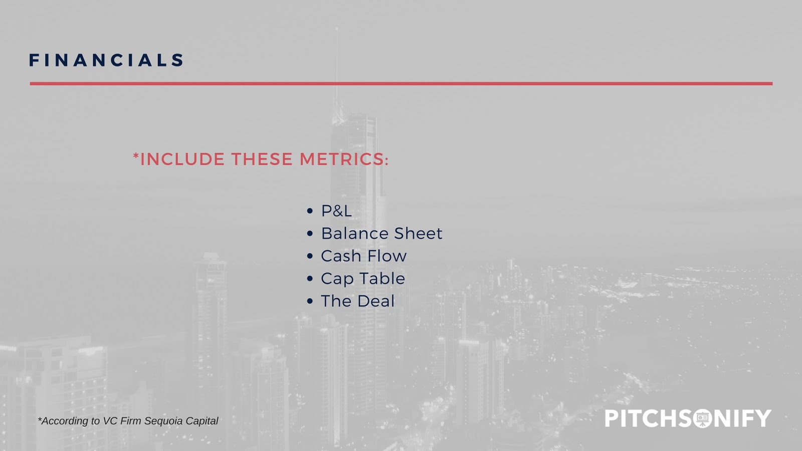
According to DocSend’s study of 200 pitch decks, financial was the most viewed slide next to team in a deck. This takes into account that Seed and Series A decks may not have this information yet.
However if you do include it, carefully deliver this information with realistic expectations.
Investors examine projections regularly. They will know when you overshoot financial expectations. Use a simple chart to show your sales forecasts, expenses, profits, and total customers.
Be prepared to discuss your projections and revenue stream with them.
The Ask

Ah, finally. You did it. The presentation is near over and you think that a simple “Thank You For Your Time” will wrap everything up. Wrong!
Your closing slide, The Ask, is important for investors to know what you are using their funds for. In this slide you want to state:
- How much money you are asking for
- What you plan to use their money for
- How the funds will help you achieve your goal
Nows your chance to include a namedrop or two. If you have other investors, discuss why they chose to invest in your company and their satisfaction with your current traction.
Best practices for your deck
Ok. Now you’ve seen some great examples. You learned the core slides you need in your deck, there’s even templates you can take home. It’s time to dive in to the best practice for your deck based on a study by DocSend that analyzed 200 pitch decks.
Here’s what we pulled from the study.
Keep deck under 20 slides
Based off the Sequoia Capital structure mentioned above, the study revealed that successfully funded decks included these slides:

Notice the top contenders:
- Team
- Product
- Business Model
- Market Size
- Company Purpose
Structure Your Deck In This Order
The study revealed a similar slide order to the Sequoia template we discussed earlier in the post. However, DocSend concluded the team slide is more effective when placed 7th versus towards the end. Their placement results were:
- Company Purpose
- Probem
- Solution
- Why Now
- Market Size
- Product
- Team
- Business Model
- Competition
- Financials
Put More Focus Into These Slides

Investors take a careful look at certain slides in your pitch. According to this study, the most important slide in question is your financials. This should come as no surprise because well, thats the whole reason they are here – to make money.
Team comes in a close second to financials. It’s an important slide to communicate to investors that you have an expert team in place that will aid in the growth of your start-up.
Steve Jobs once said:
“When you’re in a startup, the first 10 people will determine whether the company succeeds or not.”
Read Steve Jobs Tips for Hiring Your A-Team
Show investors you have the team it takes to get the job done.
Do you notice the one stark contrast between “pages that matter most” and percentage of decks image above? Take a minute and look.
Notice how “Why Now” slide ranked 4th in pages that matter most to investors, but only 45% of decks in the study had this slide.
This leads us to believe the importance of a “why now” or “opportunity” slide in your deck to stress the importance of why you are necessary and relevant to the market, now.
Choose Quality Over Quantity
While this doesn’t have to do with your decks layout, it’s an important nugget to pull from the study. The graph below is more simple than it looks. Basically, it tells us that contacting more investors will get you more meetings, but it doesn’t mean more money.
In fact, they found you’ll likely need to contact 20-30 investors versus hundreds. Focus on the quality of the connection you make with an investor. Think the stronger connection, the better likelihood you’ll get funded after your meeting. Use your network to attract warm connections, it’s unlikely a firm will even entertain cold emails or calls.
Awesome Startup Decks That Got Funded… and Why
“Delivering a successful presentation could mean landing a major new contract, better prices for your services, or getting the funding you need. Failure can mean lost customers and a business that never gets off the ground.”
Lewis Howes, NTY Best Selling Author and Lifestyle Entrepreneur
Facebook![]()
Source: Slidebean
Mark Zuckerberg and his college buddies never made a pitch deck exactly, but they did provide a media kit.
This media kit gave investors valuable insight at the company’s potential based on Facebook’s value proposition and marketing services that were used to sell ads. It also included key growth metrics such as
- Engagement
- Traffic
- Users
The key takeaway here is to backup your claims with numbers. No investor can discredit or question hard cold metrics that you’ve collected from your efforts.
Buzzfeed
Buzzfeed comes right out the gates with power in this pitch. Right after you see the familiar name in their cover title, they drop some big numbers and social proof for investors on the next slide. They include the millions of monthly users who visit their site, indication of proprietary tech (that is clearly working), and a quote from CNN.
Buzzfeed has raised nearly $500 million in capital in its day.
Takeaway? Use social proof to influence investors.
Buffer
Buffer is a social media scheduling platform and is one of the most well-known SaaS start-ups to date. The team used this start up pitch deck to raise half a million dollars which was used to get Buffer to a $60M valuation for their Series A funding. The founder released their deck to help other start ups raise funds.
What to take from the Buffer deck? Transparency. Just like Facebook, they made their number work for them. Yes, it helped that they had early traction and were cash flow positive as well. You can check out their report on it on their company blog.
Even Reid Hoffman, co-founder of LinkedIn, would admit there are things he’d fix about this deck. However, this extensive Series B deck is responsible for securing $10M in funding from Greylock.
The deck contains a plethora of insights for startups who need to create a pitch. In this startup pitch deck, the company successfully sets the stage for LinkedIn as the future of “Networking for Businesses 2.0”. Hoffman also discusses:
- How entrepreneurs should approach the pitch process
- Evolution of LinkedIn as a company
- Consumer internet landscape in 2004 vs. today
Mixpanel
Mixpanel, an advanced analytics platform for mobile and web, used this deck to raise $65M to give them a valuation of $865M. Yea.
The deck is simple. Not much to say for the design, but the structure of their story captivates you from the start. It begins with a problem, followed by their solution and Mixpanel’s competitive advantage.
Takeaway: Keep it casual. Keep it simple. Investors are constantly bombarded with industry terms. Notice Mixpanel threw in the term “bullshit metrics”? In what should be a formal setting, that is truly eye-catching and sets the tone for the rest of the pitch.
Read more about this deck on their blog.
What Investors Look For In A Startup Presentation
Tone
Know your audience before you go in to your pitch. It’s important to determine the proper tone for your investors so they’ll relate to your pitch.
You don’t have to make it a boring board meeting. Get creative and add some character to presentation to entertain investors along the way.
Metrics
Make sure your numbers can pass the blink test. Check and double check again that your numbers are in order.
You want to back your claims with proof that your startup can make money and how much you plan to make.
Research
Validate your business model with strong research data. You will need to show that you know your market and need evidence to prove it.
Team
Investors are investing in your team and their dedication to success. Highlight your management teams past industry experience and don’t forget yours as well.
Brevity
The shorter and more concise your presentation is, the better.
“Less is always more. Verbose presentations will not impress investors and will most likely turn them off. Inspire confidence in your investors by being short and sweet.”
Jessica Zelfkant Munroe, CEO of Supplet
Presentation
Pair your stunning deck with a stunning in-person presentation. If you are a bad public speaker of any kind, practice before you pitch. Multiple times.
The Do’s of Pitch Deck Design
“There are three responses to a piece of design – yes, no, and WOW! Wow is the one to aim for”
Milton Glasier, Celebrated Graphic Designer
Keep It Simple
From the amount of words to image placement, you want to keep your deck clean. Keep words off the screen and on the verbal side of your presentation. Simplicity is easy on the brain and makes processing new information feel better.
Watch: Toward a science of simplicity Ted Talk
We’re hardwired to make quick decisions. A 2012 collaborative study with University of Basel and Google revealed users will judge a websites aesthetic beauty and functionality in 1/20th – 1/50th of a second.
Faster than it takes to snap your fingers. Again, simplicity is key to successful pitch deck design.
Use Consistency
This ranges from font size, color, headers, and style throughout your deck. Every element should follow a form that you develop before you start to design. Consistency removes uncertainty and builds trust that is necessary to convince investors that you are capable of handling their hard-earned cash.
Source Powerful Imagery
Use visual representation to help visualize emotion and convey the message on your slide. This can come in the form of stock photos (not overly cheesy ones), short videos, or illustrations that show a bit of your company’s personality.
According to research accumulated by 3M, we process visuals 60,000 faster than text. This means you can help your audience paint the bigger picture through captivating visuals instead of a bunch of words on the screen.
Apply the “Rule of 3”
People remember information in pairs of 3. It’s deemed the most persuasive number in communications and has been used by everyone from Thomas Jefferson to Steve Jobs.
You want to group your keywords and benefits into three’s in your deck. Get creative!
Instead of tossing three bullet points on a slide (which we don’t recommend), use a simple icon or product shot to communicate your message. It’ll help your audience digest the new information you are putting in front of them.
Properly Use Contrast
Contrast between your background and text is crucial to grab your viewers attention. You want to make sure your text is legible and flows well with your background. Ensure your text will pop by using this guide to determine contrast value.
For photo heavy backgrounds, add a neutral shade overlay to help your text pop.
Embrace the Whitespace
To parallel our first point of simplicity, you want to give a clean and easy look to your deck. The best way to do this is to leave enough whitespace on each slide so you don’t look unorganized and cluttered.
Decks that don’t embrace the space are hard to understand and will give off a sense of unprofessionalism – the last thing you want to do when you pitch to a group of investors.
How To Create A Pitch Deck Online
Now you’ve got everything you need on how to create a pitch deck. The next step is to get started on actually making yours! Here we’ll go over 5 softwares you can use to make a stand out, captivating presentation for investors.
Prezi For Business
For The Unconventional Presenter
Prezi does presentations differently. The company offers live, interactive HD presentations that will definitely “Wow” your audience.
With Prezi For Business, you can build and edit presentations in real-time with your team, present live via direct link, and comes with a plethora of analytics tools so you can improve based on user experience.
There’s no Powerpoint integration and they do not use traditional slide format. It’s available on Mac and Windows.
Haiku Deck
For The Customized Communicator
Haiku Deck’s made a splash in B2B for it’s diverse range of photos and themes. It comes with access to 40 million free images and truly dynamic themes designed to captivate your viewers.
The platform is intuitive and easy to use. They even categorize themes into different industries so you can get a more relatable fit. Make sure you have a good internet connection, for most of the features are online only.
Keynote
For The Powerpoint Lover
Keynote has become the Powerpoint alternative in presentation softwares space. If you own a Mac past 2013, you have Keynote readily available for use. It comes with 30 themes you can branch out from and a collection of pre stock photos.
We like Keynote because it easily presents on Apple devices, plays nice with Powerpoint, and is user-friendly for everyone.
Emaze
For Those Who Want An Emazing Deck
Emaze is an inexpensive and easy-to-use Powerpoint alternative based online. Users can build visually stunning presentations, include special effects like 3D Zoom and video backgrounds, and used on their smartphone.
It’s ideal for the everyday user who wants a better presentation but doesn’t have the technical knowledge to do so. The company’s goal was to remove time researching and preparing, so you can focus on creating compelling content instead.
Visme
For the Visual Storyteller
Visme won’t just be used to make presentations, you’ll use it for: infographics, reports, wireframes, and a ton of other content you’ll need for your company. The tools are extremely easy to use and they have 1,000’s of templates and graphics to incorporate into your presentation.
How To Pitch When You’re Actually There
“No one has ever raised capital because their pitch deck was pretty. A lot of people have raised capital because they were over-prepared, knew where their business was going, and were able to articulate that through a pitch alongside a pitch deck.”
Adam Draper, Founder of BoostVC
While a pretty deck is important, your pitch is nothing without a strong understanding of how to pitch.
The big day is here. You’ve relentlessly practiced in front of friends, family, and random strangers. This is the most important moment for the success of your brand.
Before you head in to your meeting, recall on these fine tips to better your overall presentation.
Get the big message across in 60 seconds or less
Investors will give you the most attention within the first 60 seconds of your pitch. This active attention then only lasts up to 5 minutes, according to Sequoia Cap.

Your goal is to be so enticing that you change this curve. Storytelling will walk investors through your pitch and keep them emotionally engaged so they stay awake.
Deliver a clear, one-sentence explanation of exactly what you do right off the bat so investors don’t have to question 20 minutes in what your company actually does.
Carry conversational tone
Don’t be tempted to impress an investor with fancy vocabulary. Your presentation should feel more like a conversation, a discussion about the future of your product. Leaving room for them to raise questions and concerns for you to answer.
Leave time for open discussion
Again, conversation over presentation. According to Sequoia Cap, you want to limit your presentation to 20 minutes even if you have 40 to spare.
Brief them on your vision, metrics, and why the world needs you now, then open up the floor for discussion.
Gauge audience throughout the pitch
Part of pitching is to pay attention to your audience. After 5 minutes, check in with investors. Odds are they have seen or been apart of similar products and niches.
You want to address any concerns or biases they have before going forward.
Don’t dive too deep into business model
Yes, financials are important to investors and they absolutely need to know how you plan to make money. However, most understand that an early start-up business model will likely change in time. They are educated guesses over concrete proof.
They want to see that you plan to solve an important problem, rather than the subscription plan you think you will use.
Let go of the idea of NDA’s
We understand you want to protect your ideas, but you are going to an investor for a reason. And they have you there for a reason. They don’t want to steal your ideas.
This will turn VC’s and angel investors off because they aren’t looking to get sued when they see the same idea in the future. This is a big no and will definitely derail your chance to raise capital.
Present metrics, not ideas
Delivering an idea all on it’s own will not get you funded. An investor needs confirmation that there is potential for scalable growth.
Be sure to give them what they want, with a little dose of creativity and personality alongside it.
Parting words…
An investor pitch can be intimidating, we know.
There’s a lot that rides on an investor meeting. You can walk out on top with a ton of capital on hand, or utterly defeated and sent back to the drawing board.
It’s tough, but it’s something that you can absolutely accomplish with the right tools.
We’ve raised over $100M in capital using these same principles to get start-ups and small businesses the funding they need.
That’s why we shared it with you. So you can get the capital you need for your brand.
We hope this article was helpful in your journey. Feel free to leave a comment or share your story about how you got funded.

 December 15, 2017